I thought it would be fun to provide an update on the US economy in graphical form. These charts were generated using the Federal Reserve Bank of St. Louis website known as ‘FRED’.
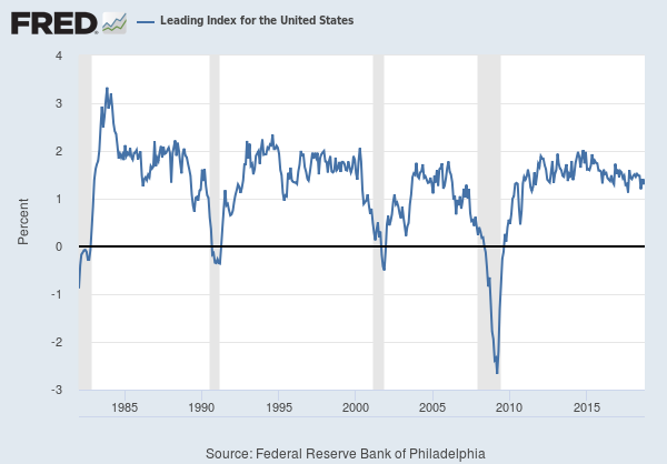
Grey bars in the slides denote prior recessions. The Philadelphia Fed Leading Index is a composite derived from multiple variables. Note that the LEI has fallen prior to previous recessions.
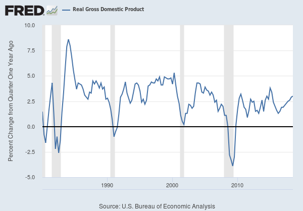
Real GDP is growing at a rate of 3% year over year. We are long into the current recovery and it is likely growth will slow a bit in 2019.
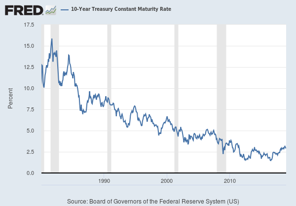
Interest rates continue to normalize. Ten year treasuries are currently yielding 2.88%. Rates have come down a bit since the 3.22% high from November 2017.
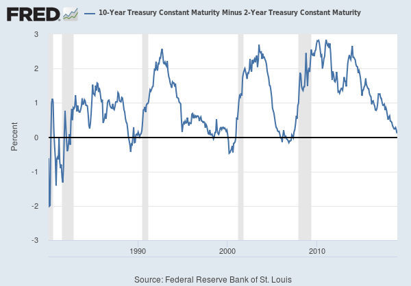
One of the key metrics market observers track is the difference between the 10Y interest rates and the 2Y interest rates. When the 2Y rate exceeds the 10Y rate the yield curve is said to be inverted. Recent market volatility has been attributed to the flattening yield curve.
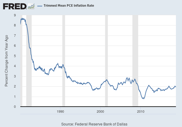
The Federal Reserve has a dual mandate that includes keeping inflation in check and seeking full employment in the economy. The Fed uses personal consumption expenditures as their core metric for inflation. The Fed targets a 2% inflation rate. The latest reading (Nov 29) showed year of year inflation in October of 1.91%. Some have argued that the Fed will back off on further interest rate hikes next year, given that PCE seems to be in check. Wages are growing at real rate of about 3%. Some argue that wage pressure will eventually lead to price inflation.
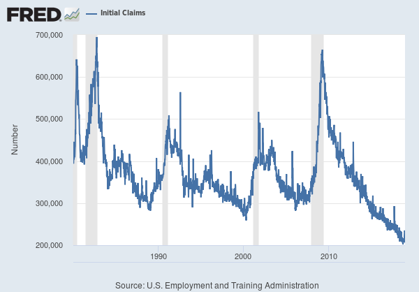
One of the core components to leading indicators is the initial unemployment jobless claims. From the graph we can see that initial claims tend to rise prior to recessions. From the current readings, a recession does not appear to be imminent.
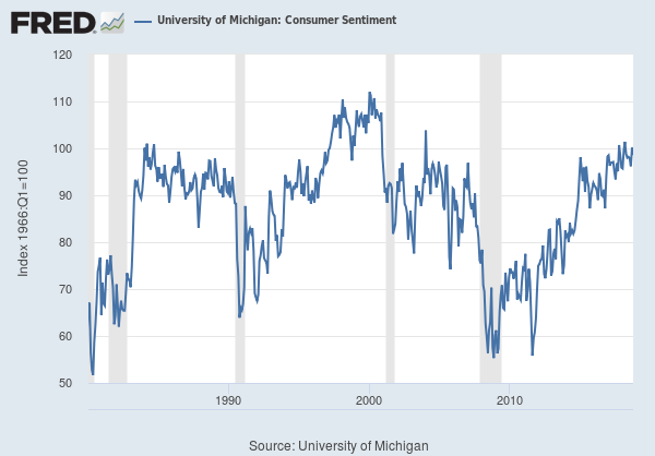
Consumer sentiment as measured by the Michigan Consumer Sentiment survey is quite strong. From the graph below, we can see prior to past recessions, that consumer confidence has tended to fall just prior to or concurrent with economic recessions.
